Elevating a Legacy.
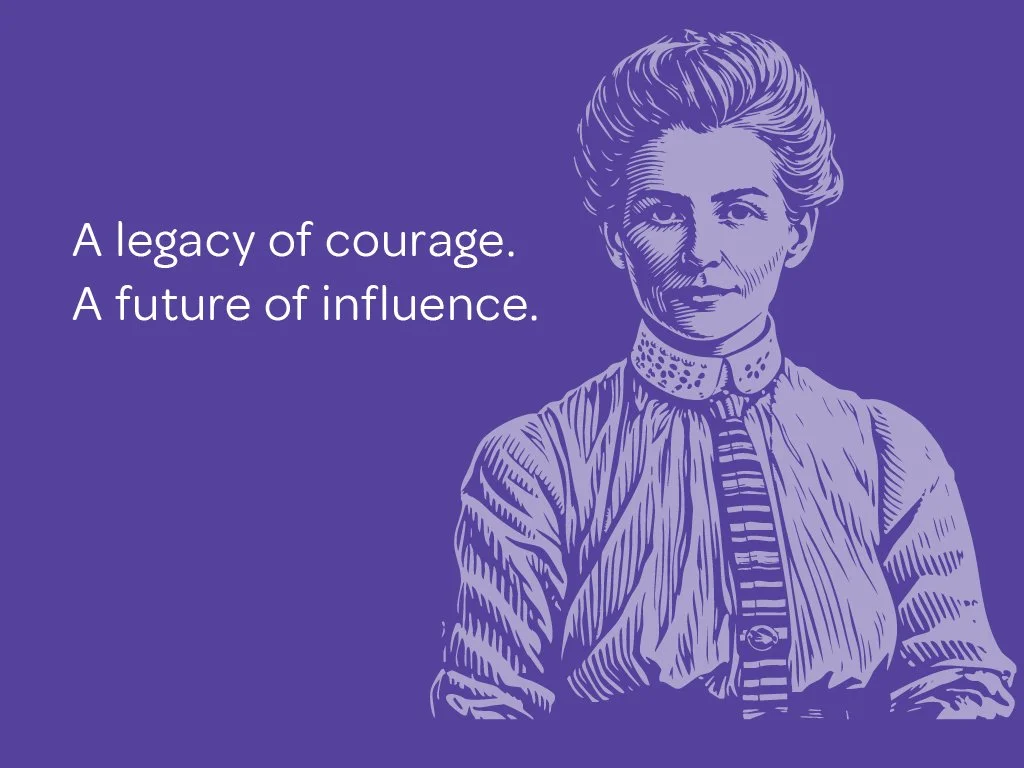
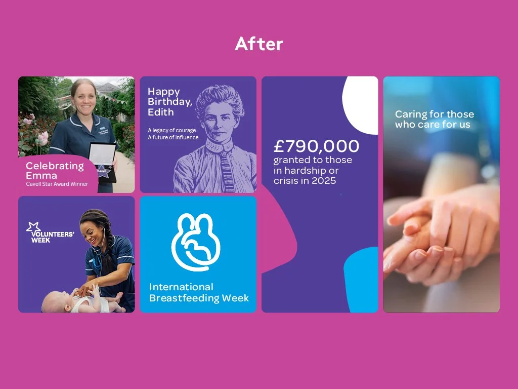
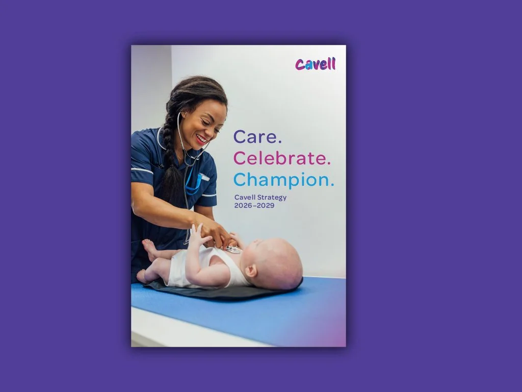
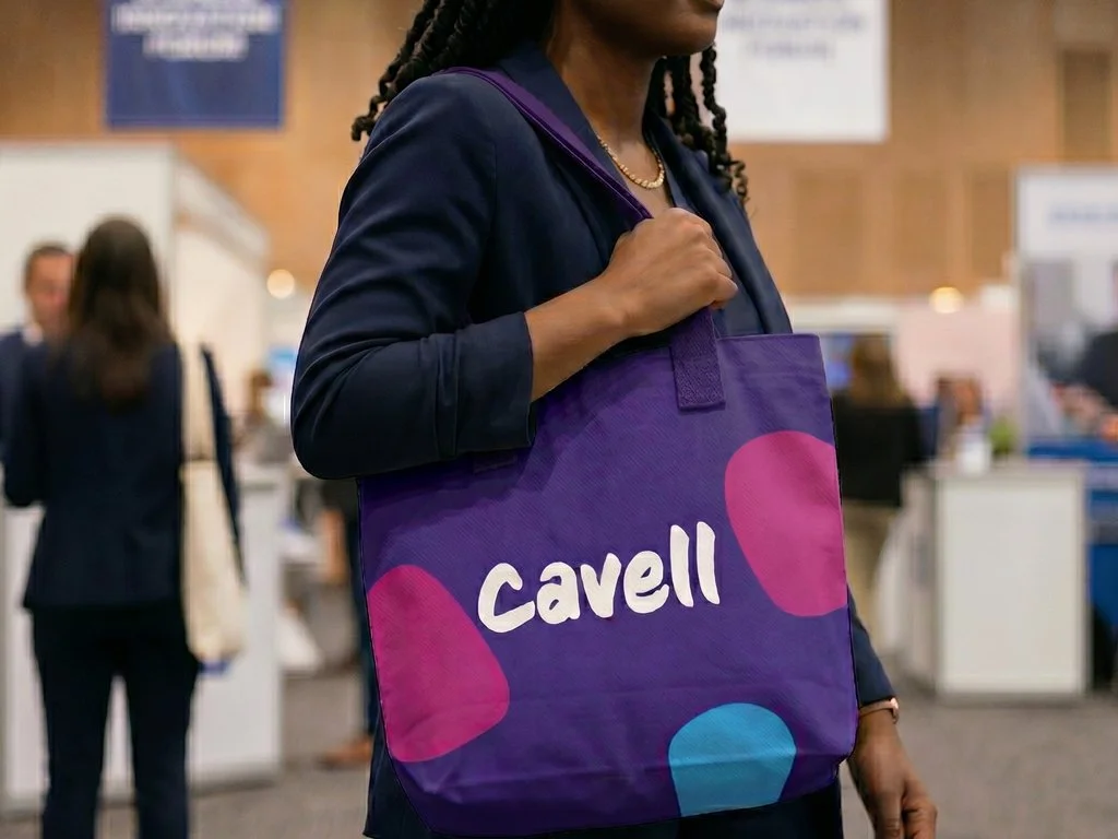
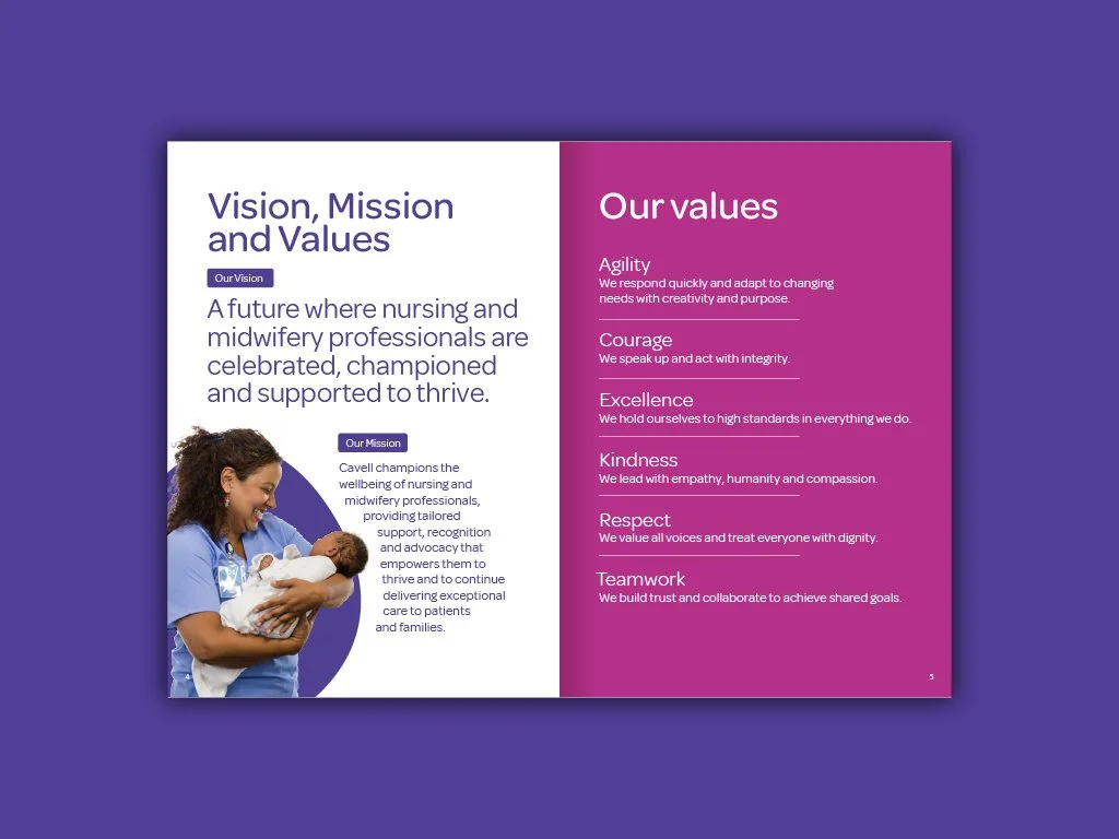
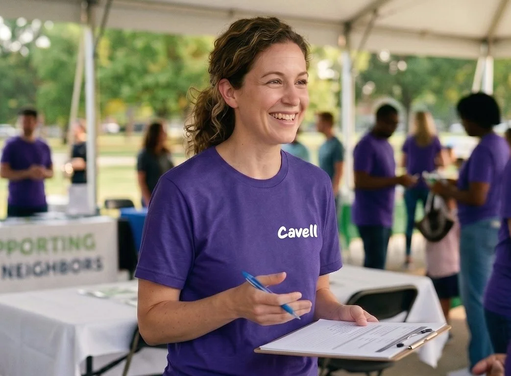
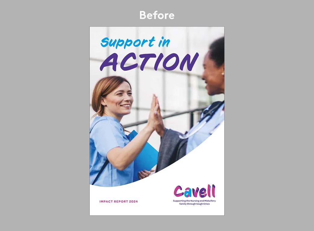
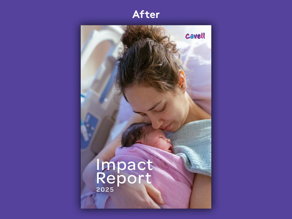
Cavell is an incredible UK charity that steps in with vital financial, emotional and holistic support for nurses, midwives and nursing associates when they hit personal or financial crisis. They came to me for a fairly light-touch brand refresh that needed to shift the dial on their visual professionalism while remaining straightforward enough for their internal teams to administer themselves going forward. The core brief was to keep their existing, familiar logo - preserving all that hard-earned legacy - but to rebalance it and build an entirely new, sophisticated design language that felt like a natural extension of it. Alongside this, I developed a bespoke illustration of their founder, Edith Cavell - the pioneering British World War I nurse celebrated for her remarkable bravery and devotion to saving lives - bringing her historic inspiration into the modern identity. The overarching challenge was to pivot away from some of the softer, older design elements and evolve the brand into a space of "warm authority" that treats its audience with maturity.
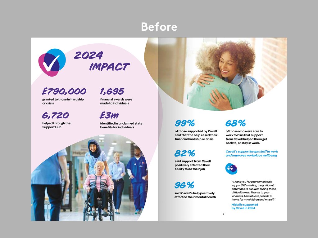
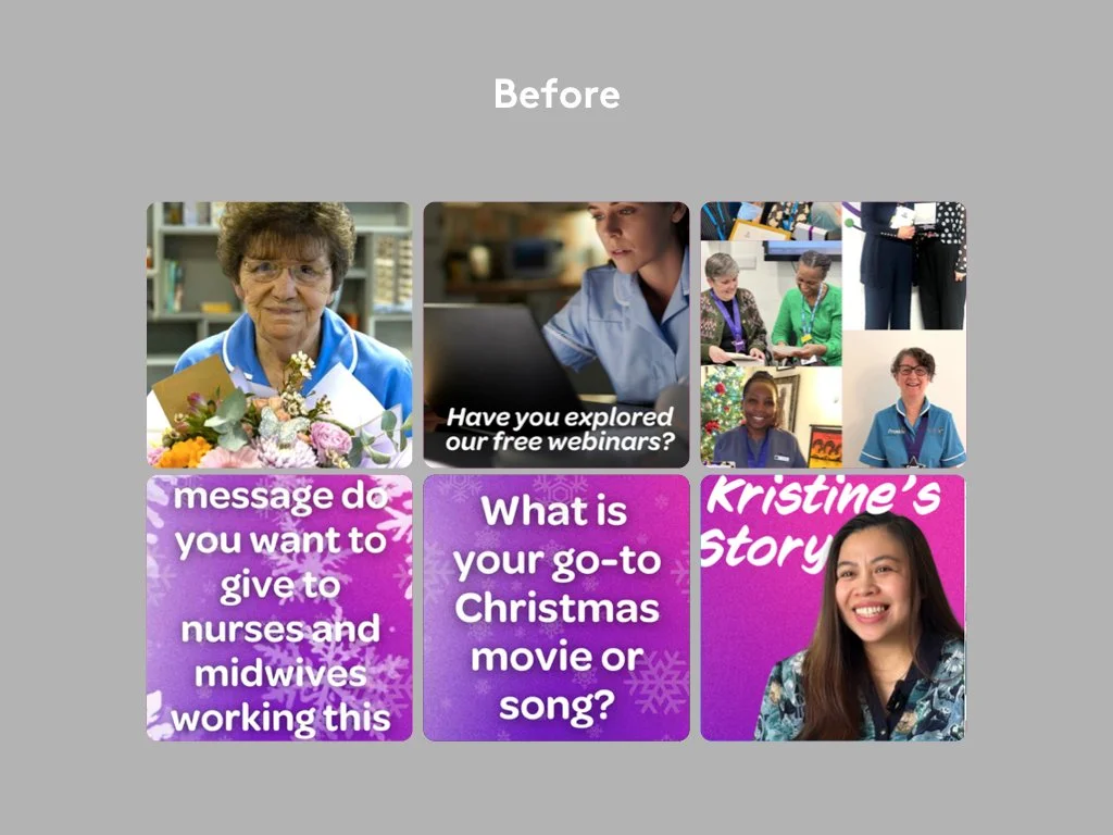
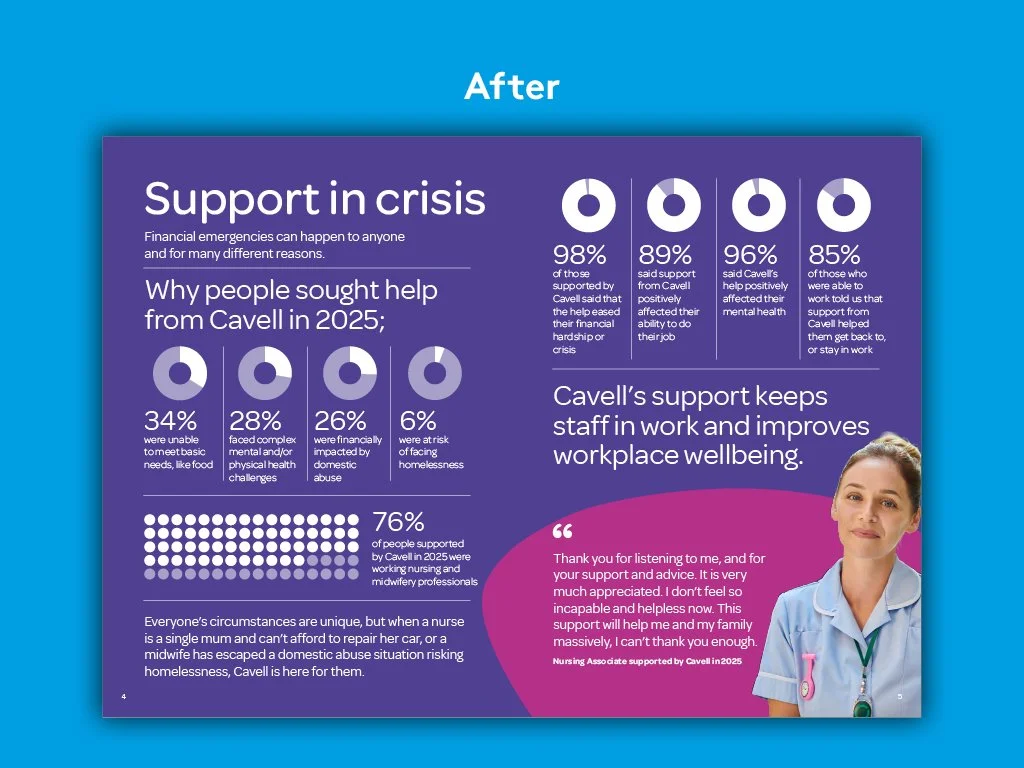
To achieve this, I tightened up the design architecture and established much stricter, more disciplined guidelines for how elements interact. I overhauled the typography, replacing an overly informal typeface with a much cleaner, more disciplined typographic structure that improves the overall reading experience. I also introduced a refined, reduced colour palette anchored heavily in their signature purple. Everything is now built upon a precise grid where messaging, my new founder illustration and photo cut-outs take centre stage. The old 'egg' motifs were swapped out for clean, self-contained shapes derived from the logo forms, and data-driven statistics are now housed in bold, impactful blocks. These tightened rules ensure that even complex, data-heavy information retains an assertive, credible structure that instantly commands respect from policymakers.
Ultimately, this refresh delivers maximum impact through subtle, highly structured changes that the internal team can easily roll out across the templates I provided. By grounding the familiar logo within this more disciplined, professional framework, I have given Cavell the visual tools to match its growing ambitions. It is a robust yet accessible solution that feels deeply empathetic to healthcare workers in hardship, while giving the charity the authoritative voice it needs to champion them on a national stage.