Inherited Trust.
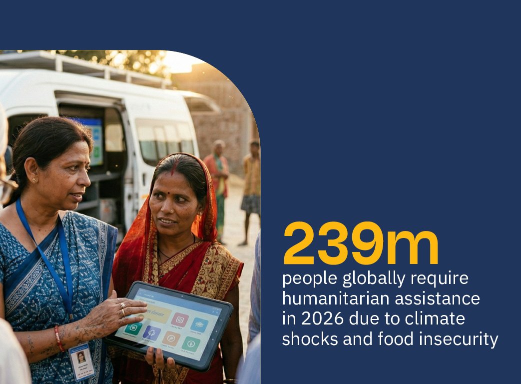
By 2026, the humanitarian sector is under more pressure than ever - over 239 million people need assistance globally, driven by climate shocks, conflict and food insecurity, and the traditional evidence pipeline (years-long academic studies that turn up long after the crisis they were meant to inform) just isn't fit for purpose any more. The Humanitarian What Works Centre was set up to close that gap, as a joint initiative between Elrha and the International Rescue Committee. Elrha brings deep credibility in evidence generation and innovation; the IRC brings frontline operational authority and delivery reach across 40-plus countries. Neither could do this alone, so the brand challenge was really about designing a relationship: HWWC needed its own authority as a flagship evidence hub, while staying visibly, credibly connected to the two organisations behind it.
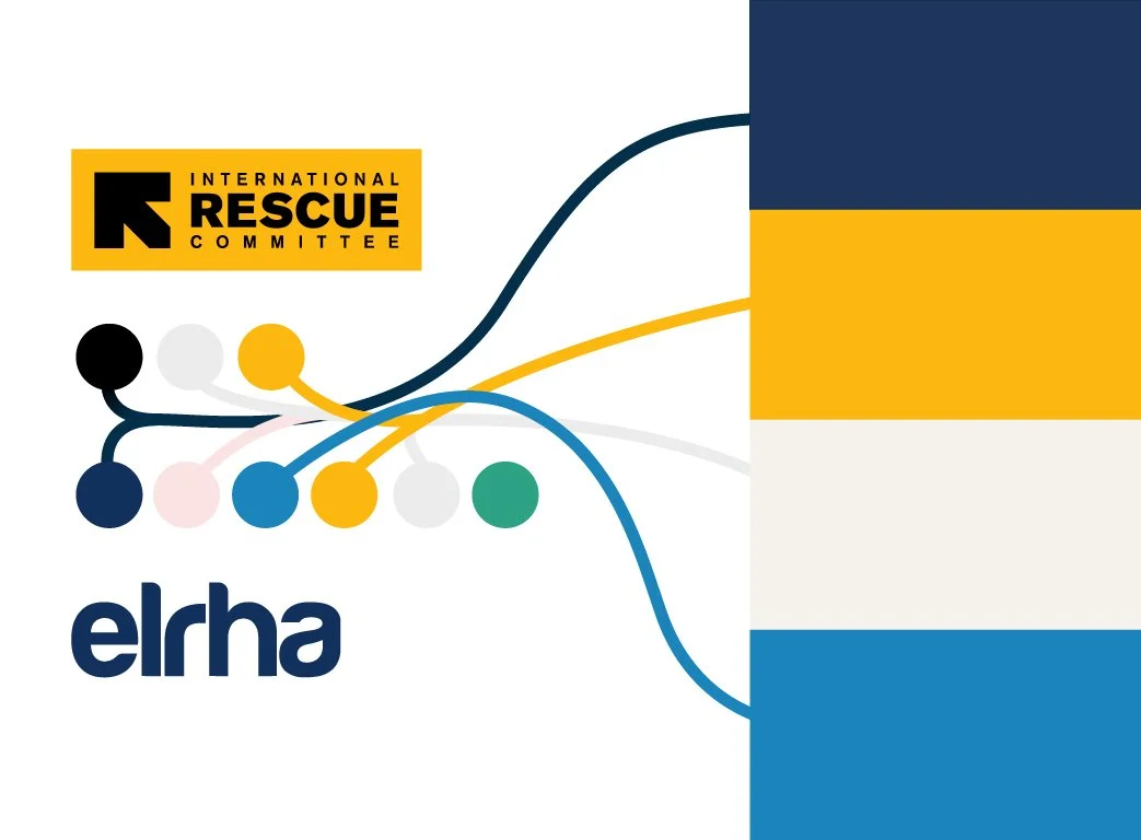
The idea holding the identity together is synthesis - taking what's distinctive from each parent brand and fusing it into something that feels established from day one rather than newly invented.
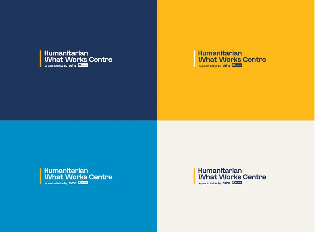
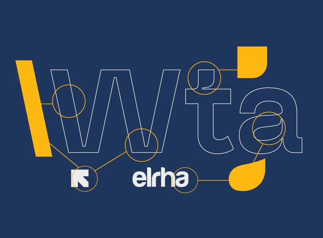
Think of Elrha and the IRC as proud parents: HWWC inherits Elrha's editorial confidence and research credibility, and the IRC's boldness and operational directness, while claiming its own territory too. The headline letterforms are a good example of this in miniature - they nod to the squared-off, no-nonsense character you see in the IRC's own wordmark, while carrying the kind of considered, slightly warmer detailing that feels closer to Elrha's world, so the type itself sits somewhere between the two rather than borrowing wholesale from either. The colour palette works the same way - it was developed as a genuine blend of tones lifted and adapted from both parent brands, so HWWC never looks like it's clashing with either one when it's placed alongside them. It can sit sympathetically next to an Elrha or IRC document without ever feeling alien, while still being clearly its own. Known elements are refined and recombined, so the Centre transfers the hard-won trust of its parents rather than rebuilding it from scratch, while still reading as its own serious, lasting institution rather than a bolted-on side project.
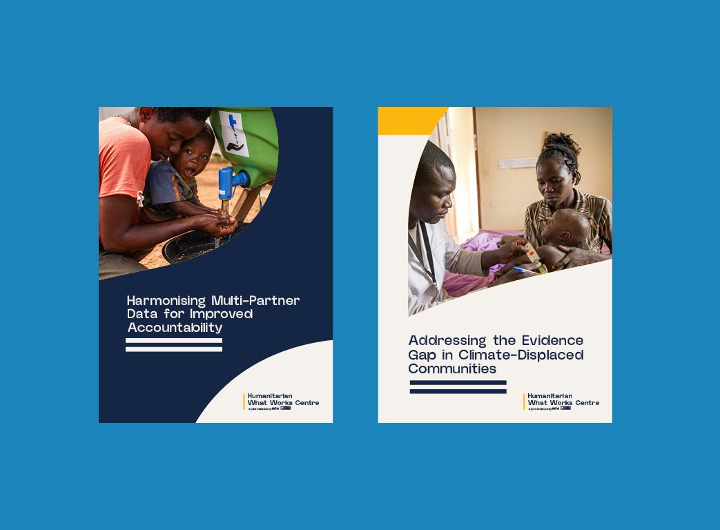
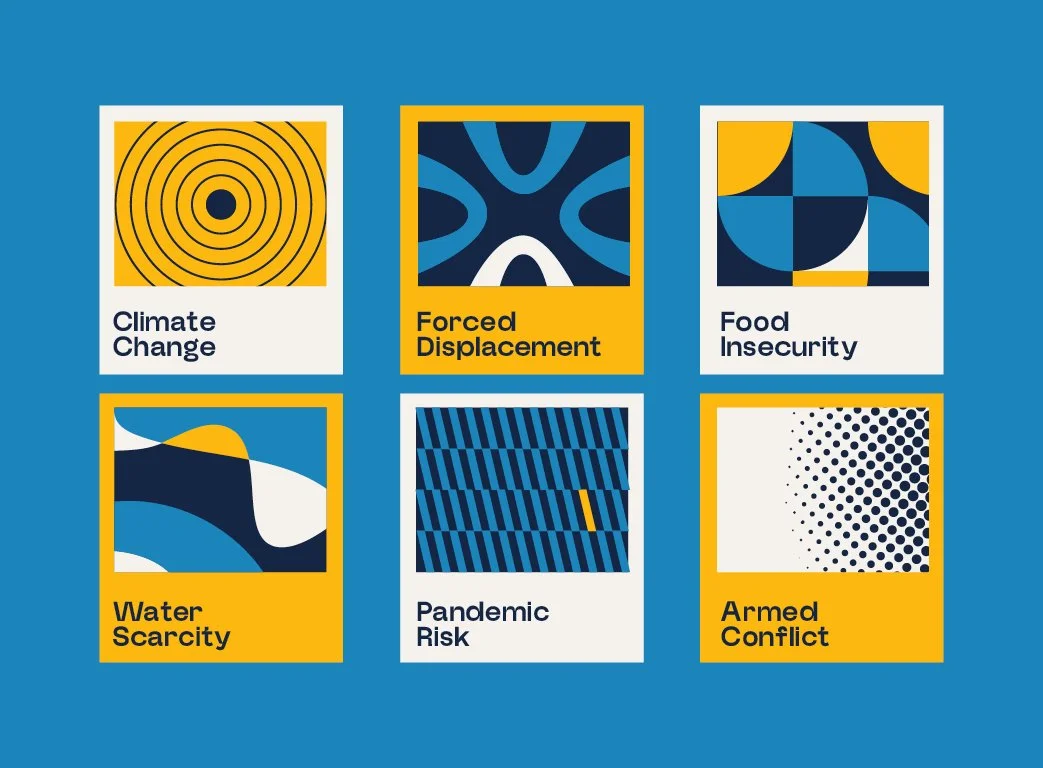
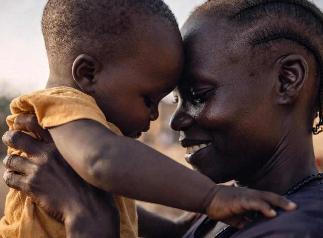
Two things shaped almost every design decision beyond that. First, tone: the brand had to feel hopeful and energising rather than cautious or academic, which is where the sector defaults far too easily. Second, positioning against genre - HWWC is not an impact accelerator, and needed real distance from that slick, network-diagram, glowing-hands style of innovation branding. That shows up clearly in the imagery rules, which favour authentic, active co-creation between equals over polished or paternalistic aid scenes, and in a deliberately sector-agnostic, geography-agnostic approach that avoids reading as a Global North initiative.
None of this works unless it's actually usable by the researchers and comms generalists who'll produce most of HWWC's output day to day, not designers. So the system comes with ready-made PowerPoint, Word, InDesign and Canva templates, locked formatting styles, and typography that's been chosen with genuinely global reach in mind - it renders properly across a wide range of scripts and languages out of the box, so a document doesn't fall apart or need substituting when it's produced in a language that isn't English. That's backed up by firm accessibility rules around captioning, alt text and protecting the identity of vulnerable people in imagery. The result is a brand that's hard to get wrong and does real work: instant credibility borrowed from two trusted institutions, combined with a distinct voice of its own, built to help evidence actually reach the people who need to act on it.